


Color Theory Explained with Chibis
Written by Teresita Blanco (The Artsy Sister)
I was thinking of making some more technical how to videos. I then came up with color theory. One does not need to go to school to understand the logic of color theory.
First a little history lesson. Color theory was researched by the impressionists. While academic painters focused on recreating life, the impressionists were more into color and emotions.

They noticed that certain colors drew you to a painting, while others made you look away. After much research, the color wheel was invented, and we all get to benefit from it.
The reason why one studies color theory is to understand the proper way to use color in a painting. Only fools try to compete with the camera. When it comes to painting, a fellow wants to see your vision of the world.
If a fellow wanted to see a perfect recreation of something, they could look at a photograph. Still, even with cameras one can apply the principles of color theory by arranging the space we can control.
I might get to that eventually. The overall point of color theory is to create harmony in a painting, and to save time during the planning stages of a painting or drawing.
If you are designing a character, you can employ color theory to help you dress the fellow. You might even create an interesting hair color combination as well. Anyhow, the videos are the simplest explanations.
You can get the gist of my rant by seeing each of the one minute thirty second video. The first one deals with the difference between black and white and grayscale.
With black and white drawings, you are working with form, and lines. Depending on how both are used, you can create some very interesting artworks. With Grayscale, think of it like your typical pencil drawing, with the shadings.
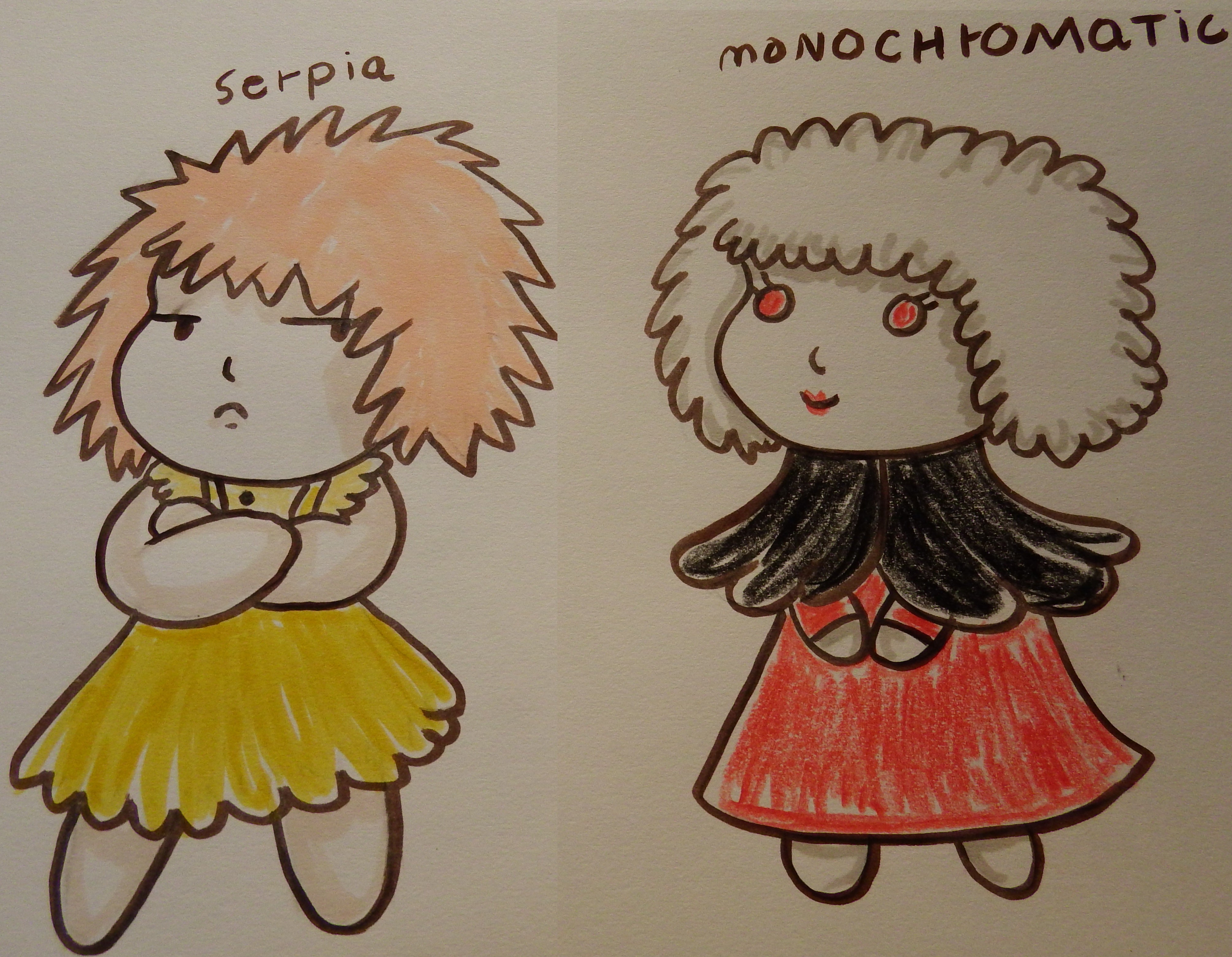
It is ideal for understanding how to work with different values of color. The next color scheme pair I introduce is monochromatic and Sepia. Both are pretty similar.
Sepia uses lots of soft golds, and earthy semi-neutrals. It is like grayscale, with the difference that you are using a nice earthy type of color. Monochromatic is also related to Sepia.
Most folks tend to confuse monochromatic, with black and white drawings. In monochromatic scheme, you pick one color. You can then lighten or darken it by adding black or white.
So, a nice winter blue painting also falls under the monochromatic scheme. This color scheme is ideal for folks who suffer from color blindness. You can just focus on the tone of the paint.
Tone is how dark or light it looks. So, if you are a color blind person, you should give monochromatic scheme a shot. Color Blind folks can also work with Sepia, since most color blind folks can perceive all the ranges of Sepia.
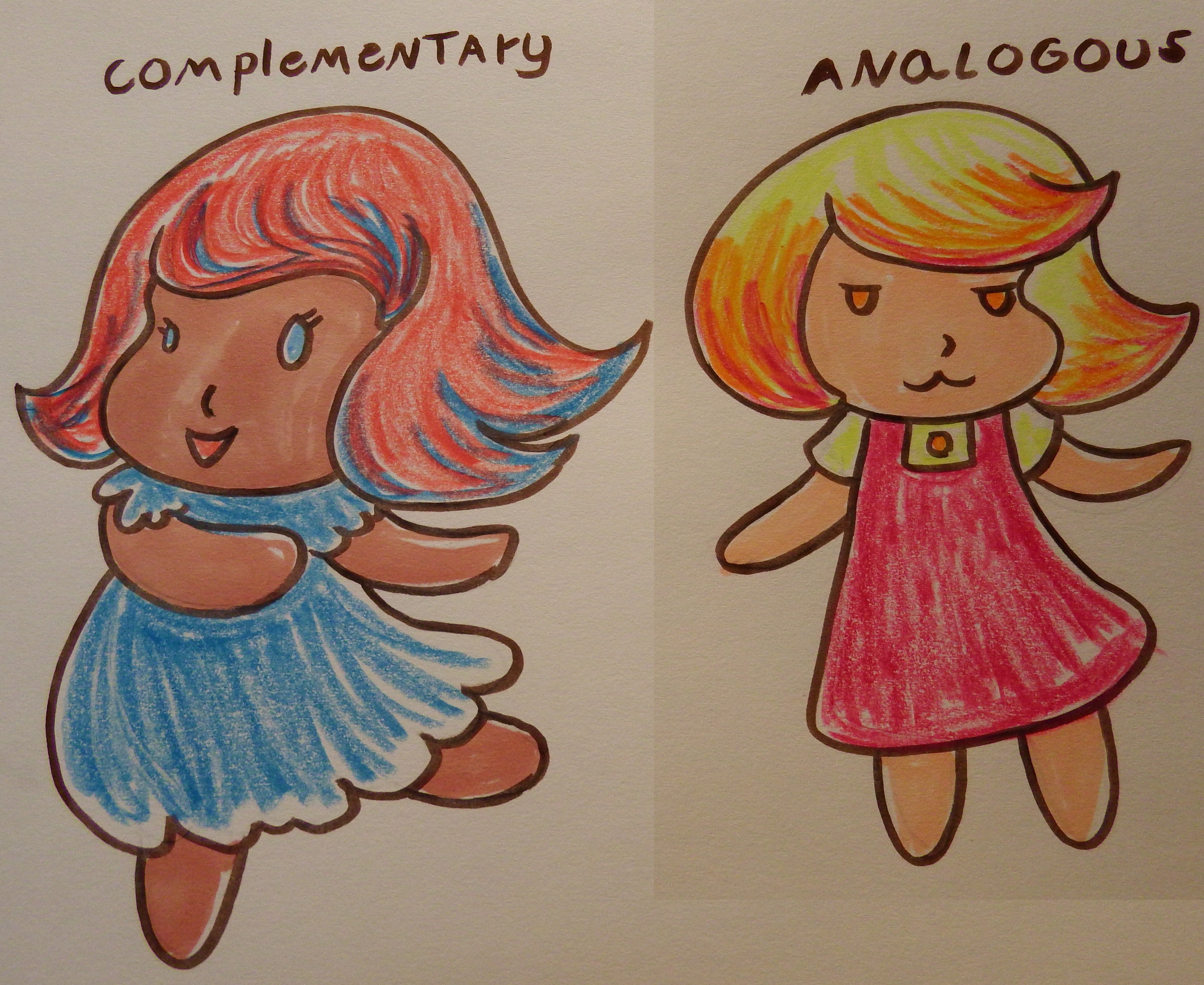
The following color schemes feature complimentary and analogous colors. Complimentary colors create harmony through contrast. As the saying goes, opposites attract.
I have my doubts on the whole opposite attraction thing. Anyhow, you can combine the colors to create fun semi-neutrals. Ideally, you want to use one color as the dominant, and the other as a subordinate.
In the complimentary color scheme, both colors compete for attention. If you want to make a sad painting, have the cold blue colors as dominant. A happy painting should have the warm compliment as dominant.
Most color wheels tend to put the warm colors on the left, and the cold colors on the right. Magenta, red, orange and yellow are your warm colors. Picking a compliment is easy with a proper color wheel.
Compliments are always facing each other. You know you chose right, if the colors neutralize each other. A neutral color has the essence of both colors, in a muted type of way.
The next color scheme features analogous colors. You just pick three colors that are right next to each other on the color wheel. For my example, I used red, orange and yellow. You can move up the color wheel.
This color scheme works due to proximity. Color blind folks can also work with analogous colors scheme. I am speaking about color blindness because I am remembering Bob Ross.
He wanted to give the gift of painting to all fellows. I think more color blind persons should give drawing a shot. It might amuse them. Show the world that you see through your eyes.
Also, get like a color palette that matches your perception of colors. Don’t forget, you are not imitating life, that is impossible and pointless. You are showing humans how you see the world.
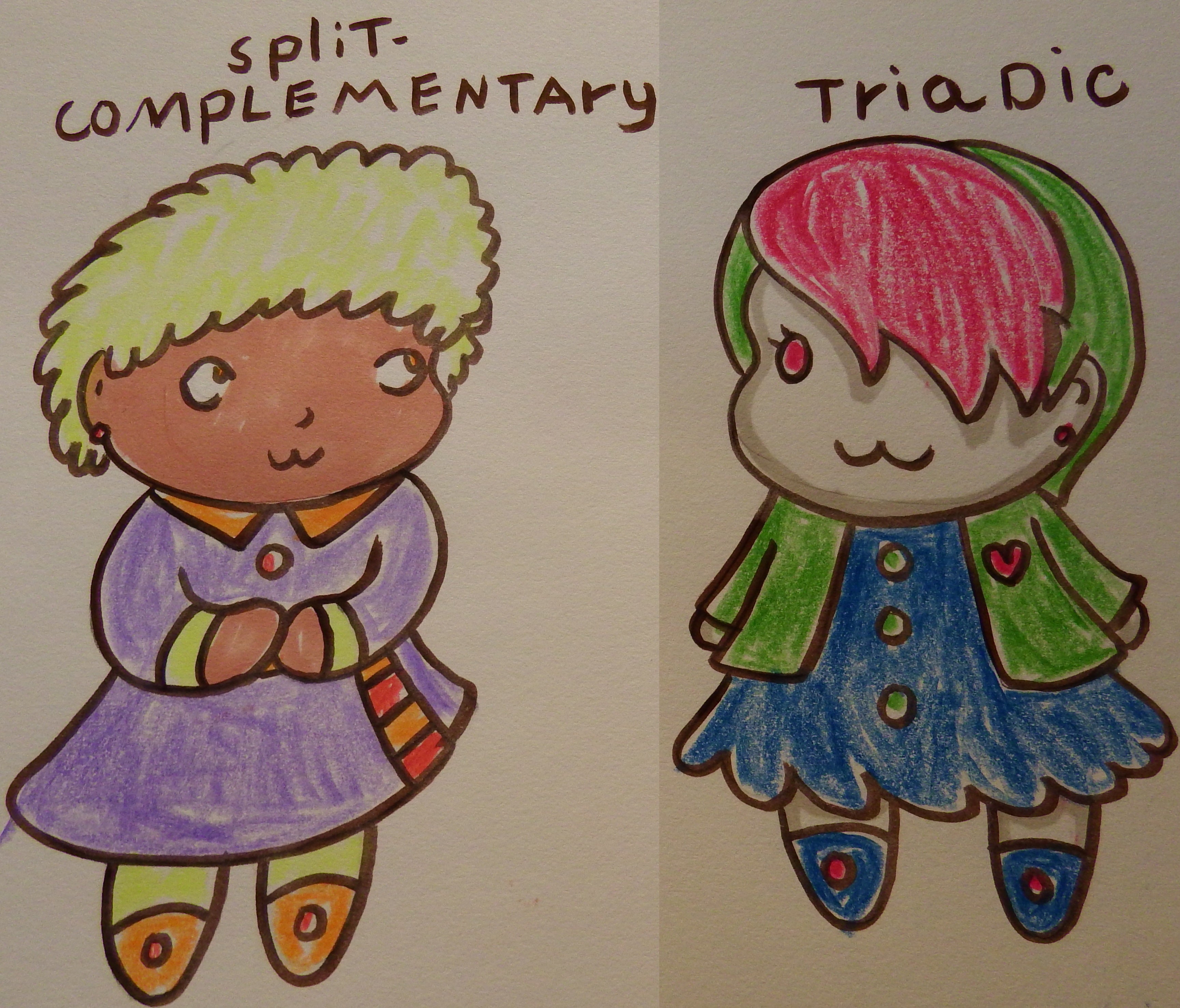
Anyhow, the final two sets of Chibi drawings feature split complimentary and triadic color schemes. Split complimentary colors is a combination of analogous, and complimentary colors.
The complementary that you must pick for this scheme should belong to the middle color. It should also be used the least.
Ideally, it should be used to highlight points of interest in your painting, or to direct the eye all over your painting. Triadic scheme just uses all the primary colors.
When creating semi neutrals, it is easy to get the other secondary colors. So, do try to avoid it.
The second triadic color scheme, relies on secondary colors. I hope you find this information amusing and informational. IF you do not want to read this long blog, you can get the gist of it by seeing the little short video tutorials.
They are all less than 2 minutes long. I tried to keep them short and sweet. If you find this blog informational, please buy the cheapest item of my store, or get one of my books. Every little bit helps in these trying of times.